COMMERCIAL PORTFOLIO
MENU DESIGNS
CLIENT: SHEARINGS HOLIDAYS
Artavia Advertising
THE BRIEF:
To create a range of seasonal menus covers.
THINKING & STRATEGY:
I took a lead in designing the look for these menus. As this was a repeat client and budget was limited, there was a minimal range of stock photography available to use, so I had to reuse some images in a creative way to keep the designs fresh and updated.
RESULT:
The resulting designs were very different to previous
menu designs for Shearings, and were repeated
with slight variations for the following year.
ANIMAL AND PET PORTRAITS
CLIENT: VARIOUS
Freelance
THE BRIEF:
To create realistic but individual portraits of pets and other animals. It is important that the portraits are realistic and represent the character of each animal, but at the same time retain an element of artistic creativity.
THINKING & STRATEGY:
I work I work in pastel and pastel pencils on recycled thick brown paper, the tone of which I feel complements my portraits. I dislike the blurry backgrounds often applied behind pastel portraits.
I do not want to distract the viewer from the portrait itself, so I prefer to leave the paper as the background.
RESULT:
Although I usually work from photographs, I aim to capture more than just a likeness of the pet in the drawings I create - I want to portray the spirit of the animal, that expression that makes them who they are.
BROCHURE DESIGNS
CLIENT: VISIT BRITAIN
Artavia Advertising
THE BRIEF:
To design A4 68-page brochures for promoting Devon and Cornwall as holiday destinations to other European countries, in four different languages.
THINKING & STRATEGY:
I thoroughly enjoyed this project. We were provided with a large range beautiful photography to work with. I like balancing text and image in a project,
and I enjoy typesetting. As the brochures had to be set in four languages, this was a fun challenge and attention to detail was essential.
RESULT:
I was pleased with these brochures - the design showcases the imagery to show the counties of Devon and Cornwall at their best.
EDITORIAL ILLUSTRATION
CLIENT: TRAVEL COMPANY
Artavia Advertising
THE BRIEF:
To create an illustration to accompany an editorial advertisement in a travel supplement, which described the author’s experience when she visited the town in India where she grew up. The idea was to promote the authenticity of the company's holidays, showing the 'real' culture and life of the destinations, not just the tourist hotspots.
THINKING & STRATEGY:
I wanted to recreate the busy atmosphere and colours around the author as she walked through the streets of her home town. I worked from photos she provided.
RESULT:
The pastels I used created a soft, dream-like quality, as though the environment around the author is reviving memories, and the colours are evocative of the country.
EDITORIAL ILLUSTRATION
PERSONAL PROJECT
THE BRIEF:
To create illustrations for a story my father told my children.
THINKING & STRATEGY:
My father told my children a story which he also told my younger brother when he was a child; I wanted to preserve this in some way for the family so created these illustrations and set the text to make into a book. I used my favourite media - pastels and charcoal - to create the snowy atmosphere and countryside feel.
I used a different angle and viewpoint for each spread, to create drama at each turn of the page.
RESULT:
My children and my father love the pictures and the book and will now be able to tell it to their families one day - keeping my father’s story alive.
BROCHURE DESIGN
CLIENT: EUROPEAN RAIL
Artavia Advertising
THE BRIEF:
To create a brochure which, although it contained a lot of copy, was easy to understand. It needed to be logical and each location needed to be separate and clear.
THINKING & STRATEGY:
There was little room for images, so careful consideration regarding their placement and selection was needed. The use of tables and breaking text down into logical sections helped keep the information clear, along with the choice of a simple sans serif font and good use of type hierarchy.
RESULT:
The design for this brochure is clean and clear, and there is a coherent structure throughout. Information is clear and concise. Each spread is designed in a way that makes each location apparent.
BOOK COVER DESIGN & ILLUSTRATION
CLIENT: BIRTHE VAN DER HEIJDEN
Freelance
“As the book is about synergy with our higher mind I was looking for creative that could imaginatively cross the divide between the different ways of perceiving. Having studied Graphic Design and Illustration with Kirstie many years ago, I knew her work to be very imaginative and uplifting and, true to form, she instantly captured the spirit of the book.
I have over time also recommended her work to my friends and from what I have seen there is always an element of magic within it that transports you to another world. It is as if through her illustrations she invites you to see life from a higher perspective. And as such she is the perfect creative fit for my first book, which guides people to do exactly this…”
Birthe Van Der Heijden
I was asked to come up with an idea for a cover which encapsulated the creative spiritual journey and the freedom this brings. I loved every minute of this project as it brought together the creation of the illustration and the typography - I enjoy working with the relationship between text and image.
BOARD GAME DESIGN
PERSONAL PROJECT
THE BRIEF:
To make a fun and engaging board game for
my children.
THINKING & STRATEGY:
I wanted to design and make an easy board
game that we could play as a family. I wanted the illustrations to be fun and full of life. I decided to
base the game around cats, as we had a cat who
got into all sorts of adventures at the time.
RESULT:
I came up with a game called ‘Nine Lives’ in which players use cat-shaped counters to move around
the board and keep as many lives as they can, whilst catching mice and rats. The illustration style I used came very naturally - it felt free and fun and jolly.
The images were created mainly in acrylic paint.
ILLUSTRATIONS FOR SIGNS
CLIENT: THE SIGNMAKER
Freelance
THE BRIEF:
To create painted illustrations to suit customer;s requests. I have to work on a variety of surfaces, including wood and slate. I also create illustrative designs for printed signs - which are either printed
on site at The Signmaker, or sent away to suppliers, depending on the manufacturing process required.
THINKING & STRATEGY:
The artwork for these signs has to be created
quickly, and I have to work to the requirements of
the customer, and at the same time be sympathetic
to the design of the sign and material used.
Each job is different.
RESULT:
I have produced a range of different designs and illustrations, and they have all successfully reflected
the customer’s individual requests.
BUSINESS STATIONERY & BRANDING
CLIENT: FI'S FARM SHOP
Freelance
THE BRIEF:
To create a logo and business stationery for a farm shop to link
with the client's existing floristry business. The client wanted the design to convey the home-grown and natural ethos her shop was based around.
THINKING & STRATEGY:
I used the same techniques and structure around the the logo design as the original floristry version, and added elements such as bunting and fresh colours to evoke a traditional country show theme. Buttermilk and cream background colours bring a 'farm-fresh' feeling.
RESULT:
The client was very happy with her designs, and requested further work on her shop front. The illustrations of the fruit and vegetables with the bee motif form her logo were used on both the interior and exterior of the shop.
GREETINGS CARD ILLUSTRATION
PERSONAL PROJECT
THE BRIEF:
I would like to create my own range of greetings cards. This is my starting point - a happy celebration of a summer's day, to uplift and brighten a day. It was inspired by the beginning of the poem 'After Apple Picking' by Robert Frost.
THINKING & STRATEGY:
To begin with, I was aiming for a card that could be used for a variety of purposes. I wanted an image that was cheerful, positive and fun, and which evoked a carefree feeling.
RESULT:
Again, the use of pastels gives a soft, dream-like quality to the image, and the use of bright colours keeps the image positive and happy.
LOGO DESIGN
CLIENT: FI’S FLOWERS
Freelance
THE BRIEF:
To create a logo for a new local floristry business.
The client wanted the design to reflect her are natural and informal floral designs, and that she grows all her own flowers. She requested that the logo would work both in one colour and in full colour.
THINKING & STRATEGY:
This logo was created through a original hand-drawn pen-and-ink illustration.
RESULT:
I sketched an idea for the design, and sent it to my client. She loved the freedom of the sketch so much, that she wanted to use it as the logo! I created a vector version of the sketch and chose a font that would be balanced with the drawing.
LOGO DESIGN
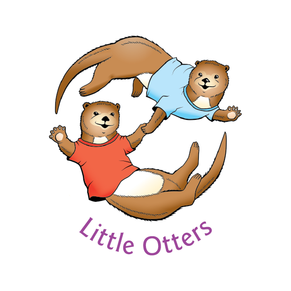
CLIENT: LITTLE OTTERS PRE-SCHOOL
Freelance
THE BRIEF:
To create a logo which was friendly and would appeal to young children and their parents alike. It would be used across media and in print, but also had to be embroidered onto the school uniform.
THINKING & STRATEGY:
I started by drawing the otters in a friendly cartoon style, whilst still keeping them relatively lifelike.
I converted this drawing into a vector image so that it could be easily reproduced. It was important that the logo promoted a friendly and welcoming feel.
RESULT:
This logo has worked well, in a variety of media, and is still being used years later. The otters’ smiles and waving paws make them seem friendly.
LABEL DESIGNS
CLIENT: JUBILEE PARK FARM
Freelance
THE BRIEF:
To design packaging labels for
home-produced foods.
THINKING & STRATEGY:
The client wanted the designs to reflect the quality, home-produced nature of the products, and the fact they are made locally in Devon. I created pen and ink illustrations for each type of product which gave a traditional, artisan feel. I balanced the illustrations with type in a simple sans serif and details in a classic script. I used gold and navy blue to evoke quality.
RESULT:
The labels work well and the client is still using them after many years, and I adapted the designs for business cards.
BROCHURE COVER DESIGN
CLIENT: HOME HARDWARE
Artavia Advertising
THE BRIEF:
To create a cover for the Christmas edition of a product brochure, keeping the design true to the brand but also making it fresh and new.
THINKING & STRATEGY:
I wanted to do something different to the covers
that had been produced before, so I created a
vector illustration and an atmosphere of Christmas shopping, rather than the collection of featured products that the client usually requested.
RESULT:
The client liked the cover design and it was chosen over the traditional format, and was used on in store promotional material as well.
ILLUSTRATION
CLIENT:
THE ASSOCIATION OF BRITISH
TRAVEL ORGANISERS TO FRANCE
Artavia Advertising
THE BRIEF:
To create illustrations of landmarks in Paris, inspired by the style of Toulouse-Lautrec. These would feature in the design for a leaflet
for a conference.
THINKING & STRATEGY:
I used a similar colour palette and silhouette style to those one used by Lautrec in his posters.
RESULT:
My illustrations were the starting point of the project, and they clearly show the Paris landmarks and the link to Toulouse-Lautrec.


